Column Chart
Use vertical bars to compare values—great for things like monthly sales, product performance or regional revenue.

Bar Chart
Represents data with horizontal bars, perfect when category names are long or when comparing items side by side.

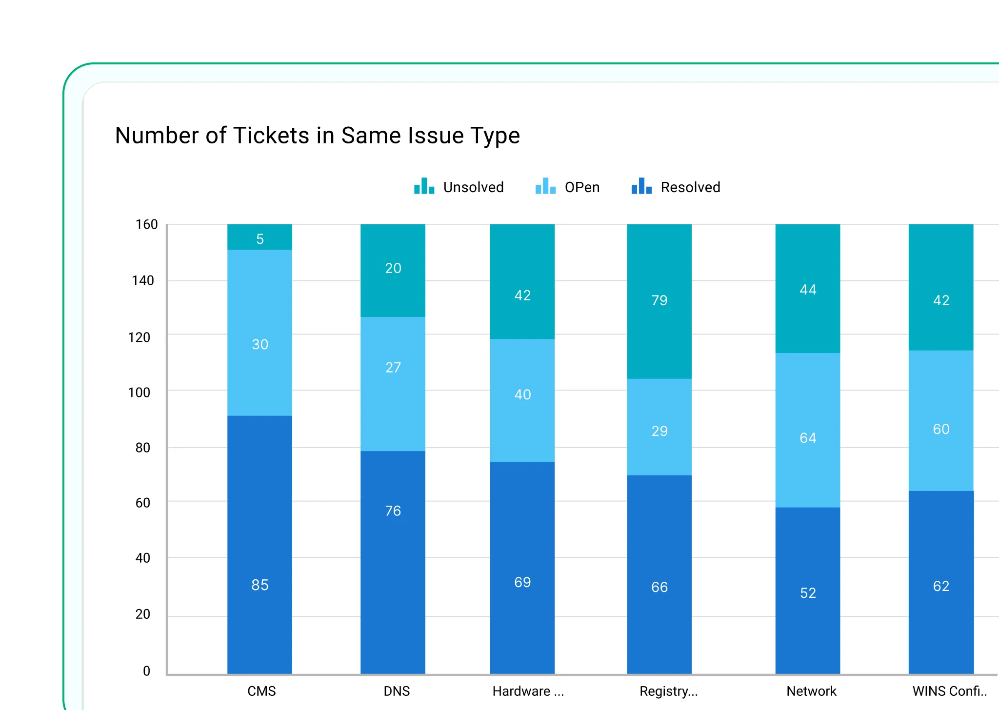
Stacked Column Chart
Shows how parts add up to a total in each vertical bar—ideal for part-to-whole comparisons.
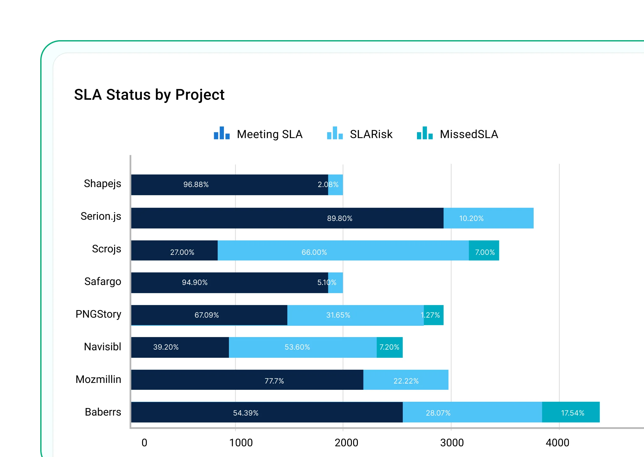
Stacked Bar Chart
Same as stacked column, but horizontal—great for long labels and comparing contributions.
100% Stacked Column Chart
Displays each column as 100%, showing how much each part contributes proportionally.
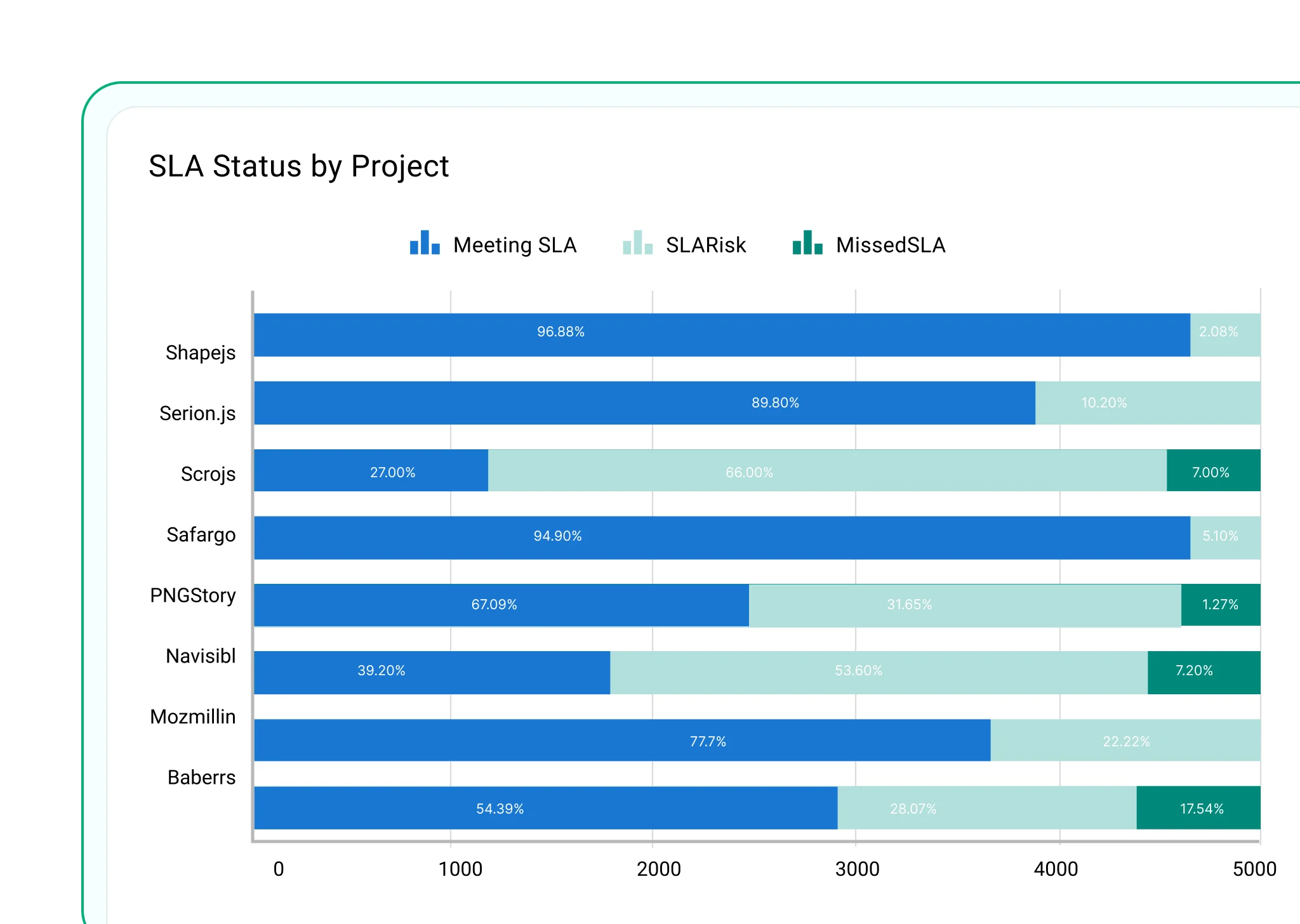
100% Stacked Bar Chart
A horizontal version of the 100% stacked column chart—useful when vertical space is limited.
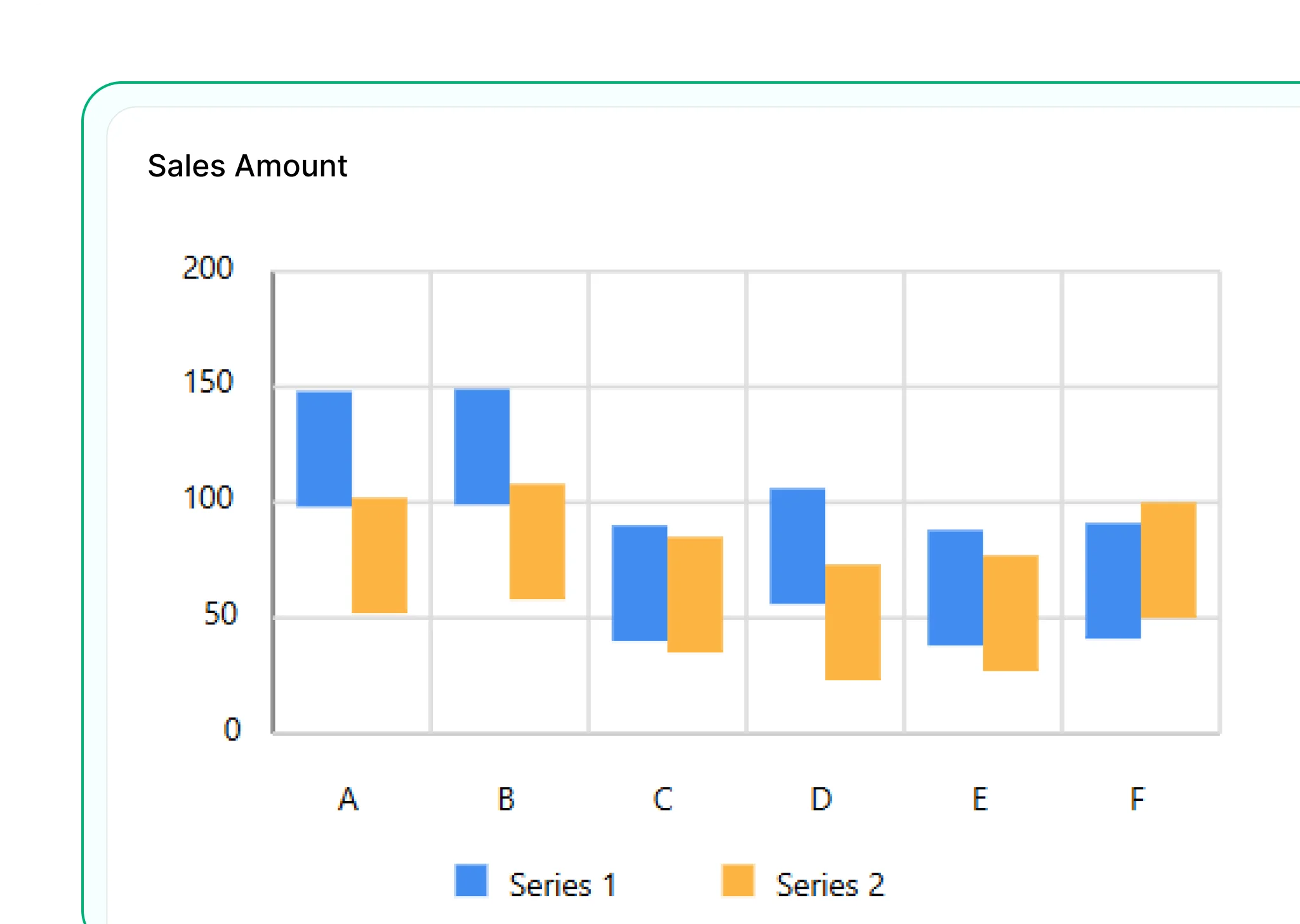
Range Column Chart
Shows minimum and maximum values in vertical bars—ideal for ranges like budgets or temperatures.

Range Bar Chart
Displays ranges with horizontal bars—useful for timelines, project durations or comparing ranges across categories.
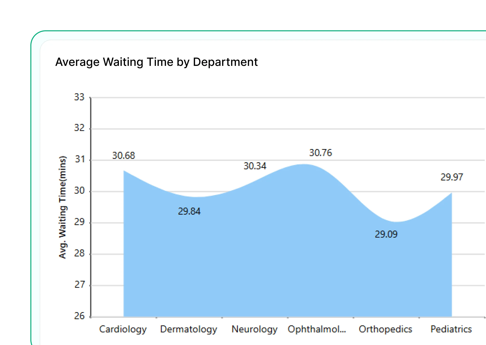
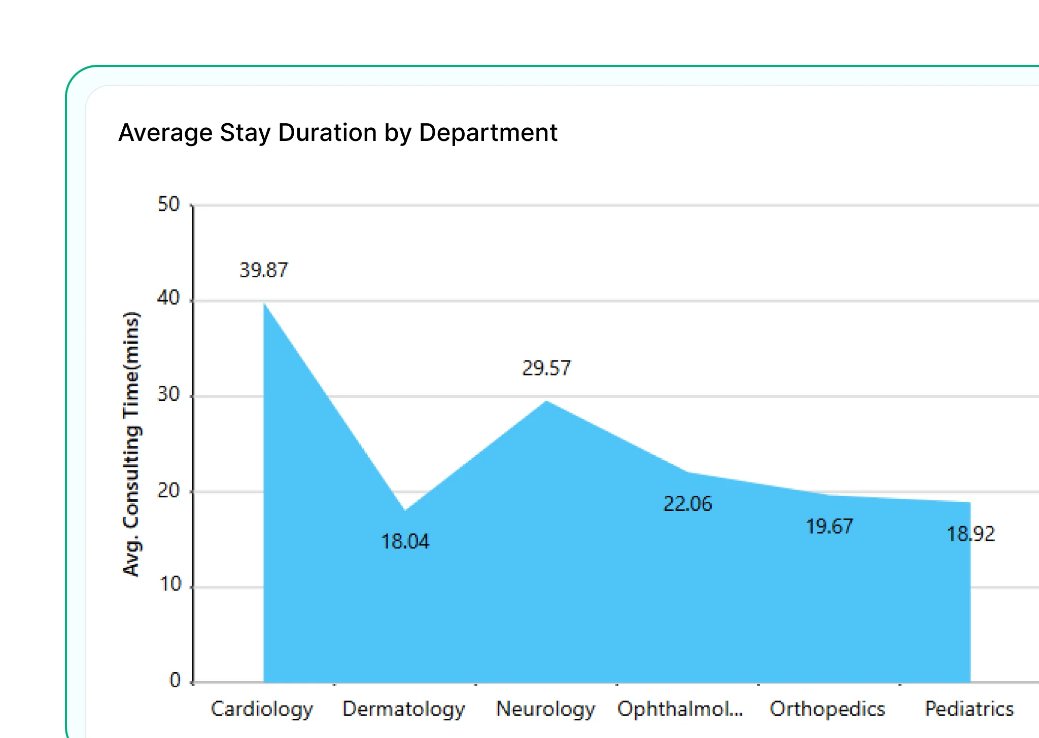
Smooth Area Chart
A variation of the area chart with curved lines and smooth transitions. Useful for presenting trends with a more polished and visually appealing flow.
Area Chart
Displays cumulative values over time using filled areas beneath lines. Ideal for showing overall trends and how totals build across categories.

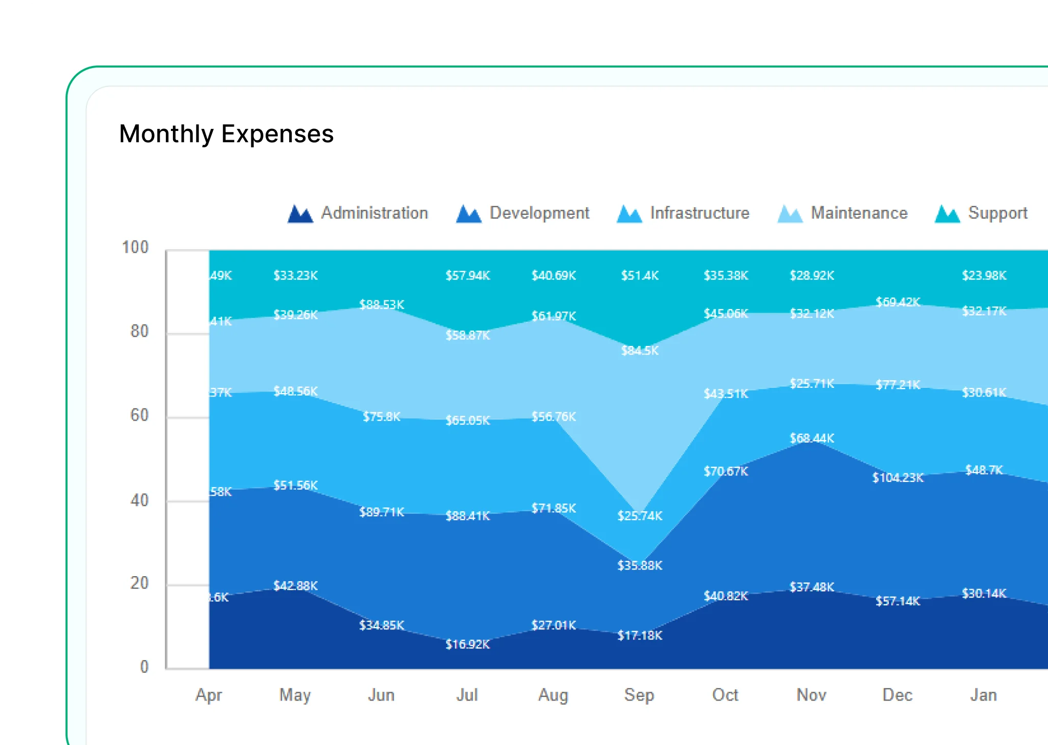
Stacked Area Chart
Shows multiple data series stacked on top of each other to illustrate how individual components contribute to the total overtime.
100% Stacked Area Chart
Displays the proportional contribution of each data series as a percentage of the total. Best for comparing relative changes across categories.
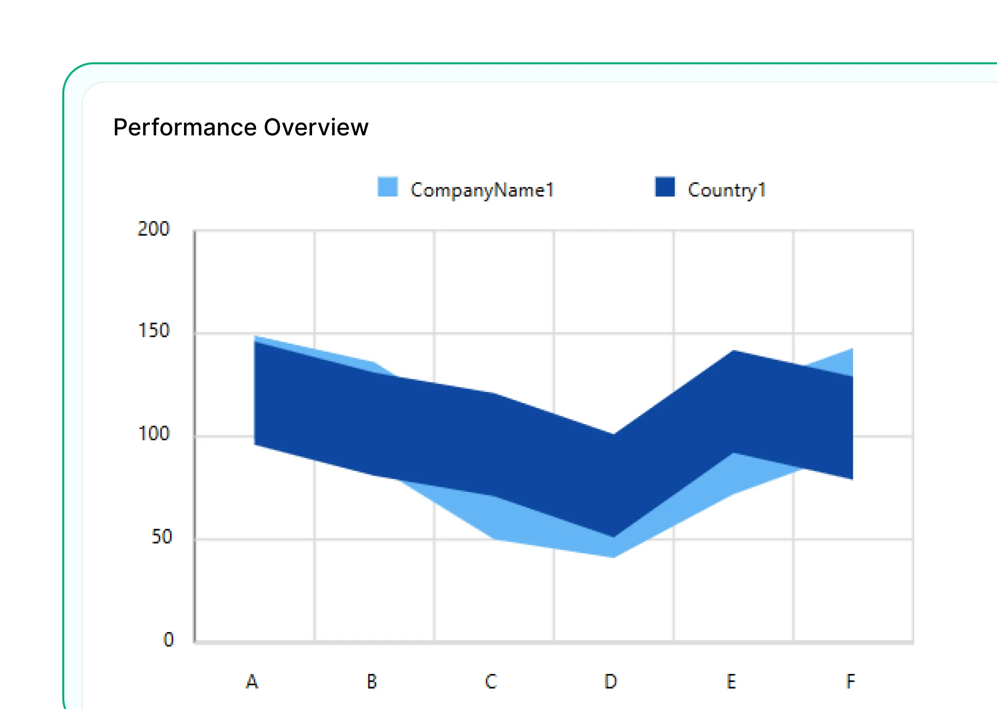
Range Area Chart
Visualizes the upper and lower bounds of data, such as forecast ranges or variability. Helps highlight uncertainty or spread in values.
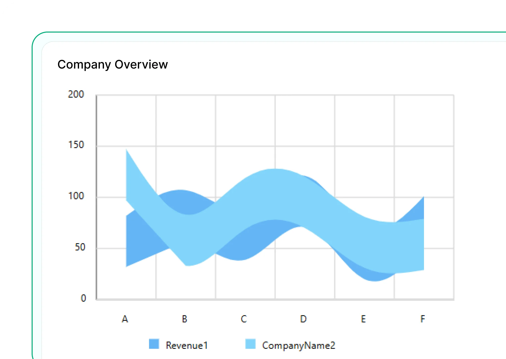
Smooth Range Area Chart
Combines the concept of range visualization with smooth curves for a cleaner, more refined look. Ideal for showing forecast intervals or confidence bands.
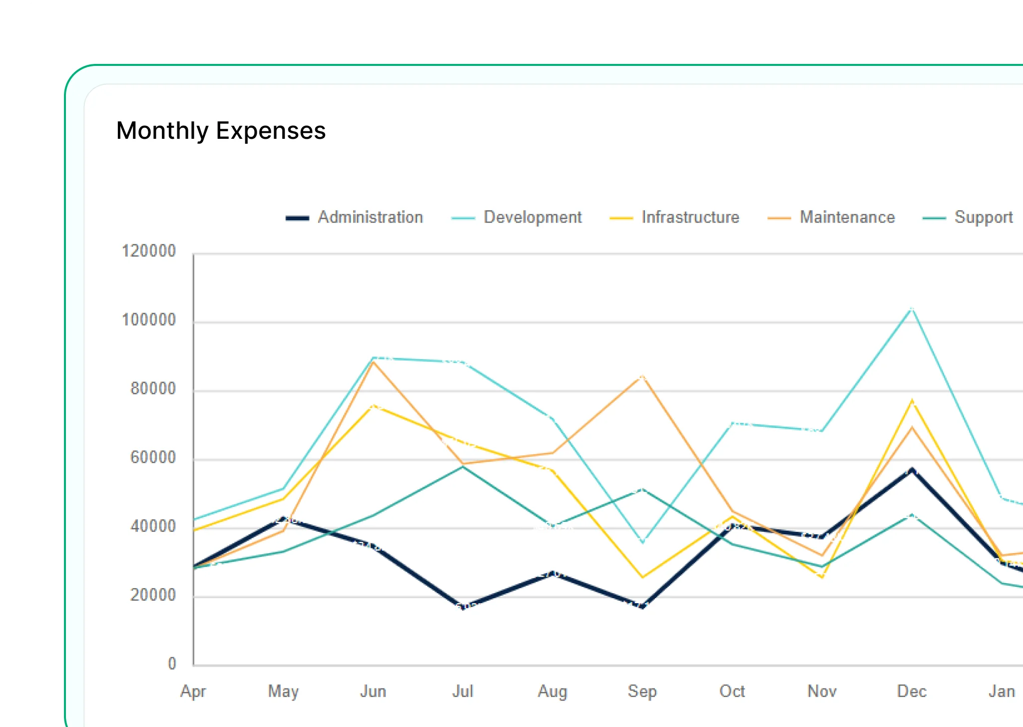
Line Chart
Connects data points with straight lines to show trends over time—like revenue or stock prices.
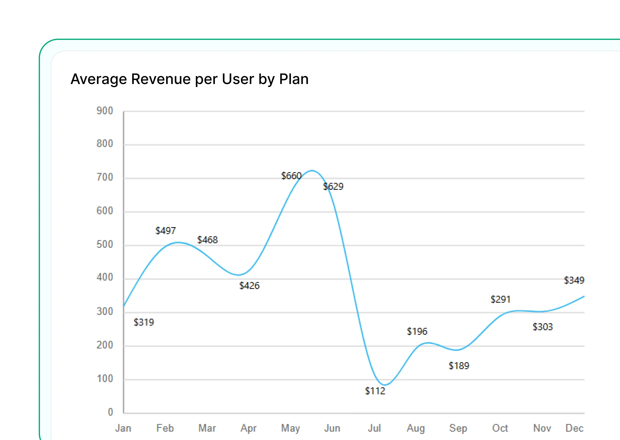
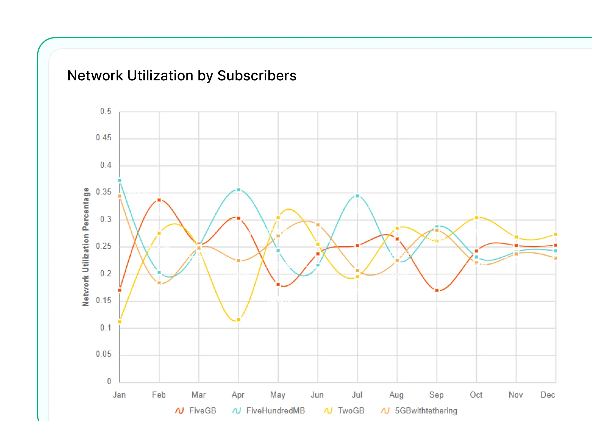
Smooth Line Chart
Uses smooth, curved lines for a cleaner look—making trends easier to follow and visually more appealing.

Stepped Line Chart
Shows changes in steps—ideal for data that updates at intervals, like billing cycles.
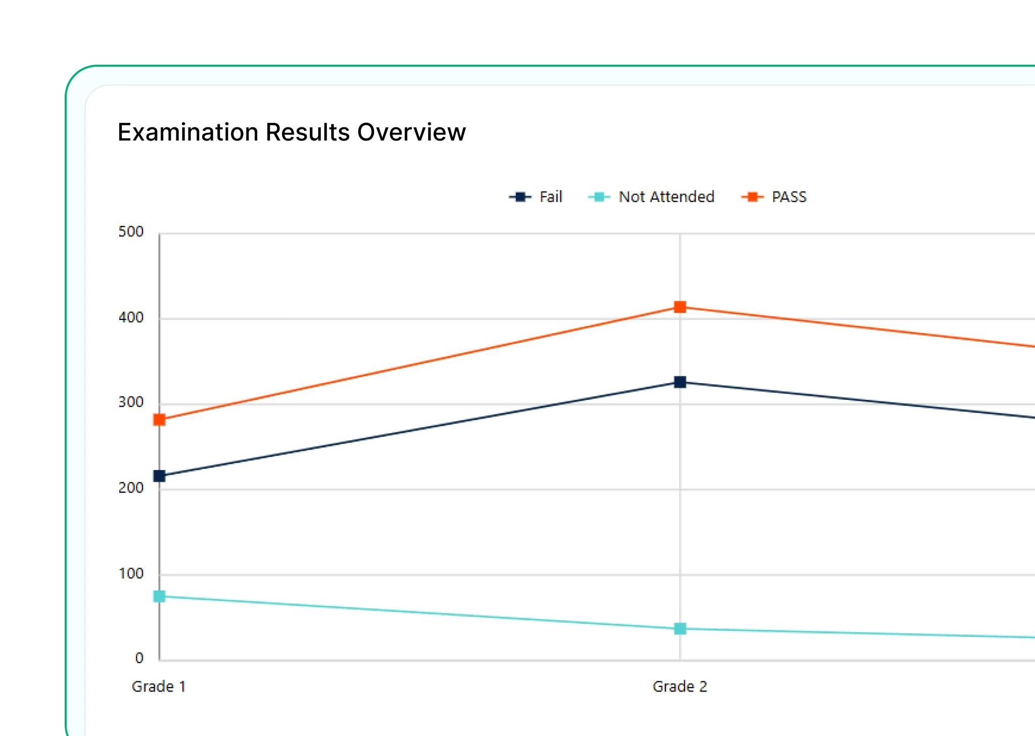
Line with Markers
Adds markers to highlight each point on the line—ideal for calling out key values or events along a timeline.
Smooth Line with Markers
Combines smooth curves with data point markers to enhance both trend visibility and individual value recognition.
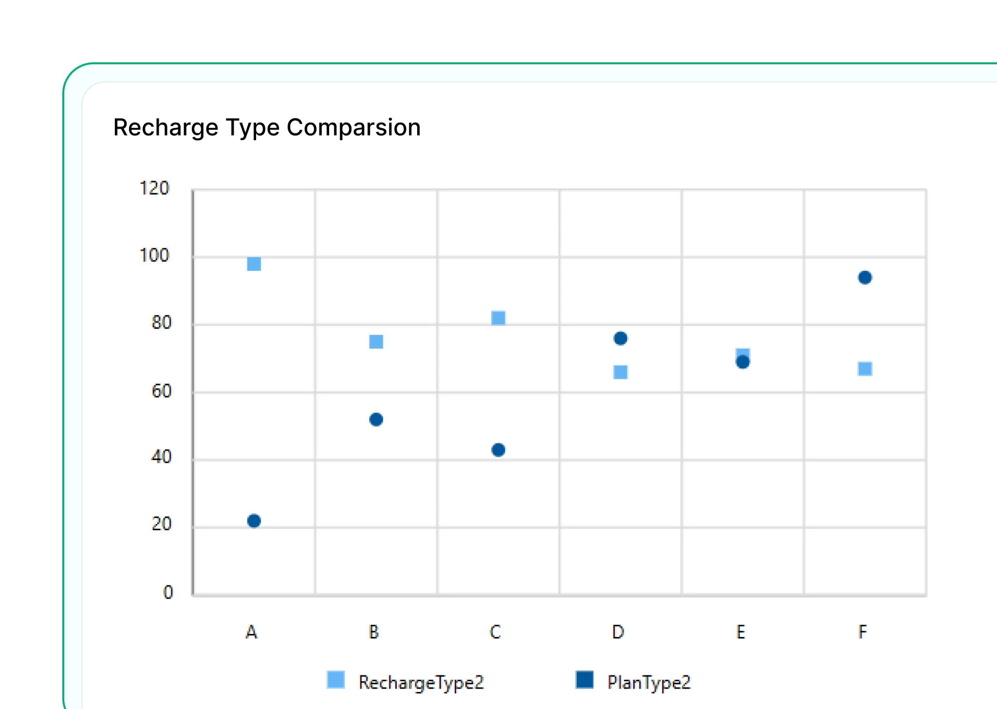
Scatter Chart
Plots individual data points based on two variables to reveal relationships, clusters, or outliers. Ideal for correlation analysis.
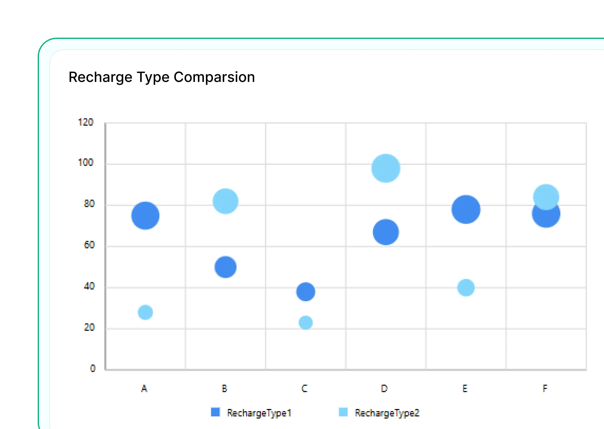
Bubble Chart
Extends the scatter chart by adding a third variable represented by bubble size. Useful for visualizing impact, volume, or magnitude.
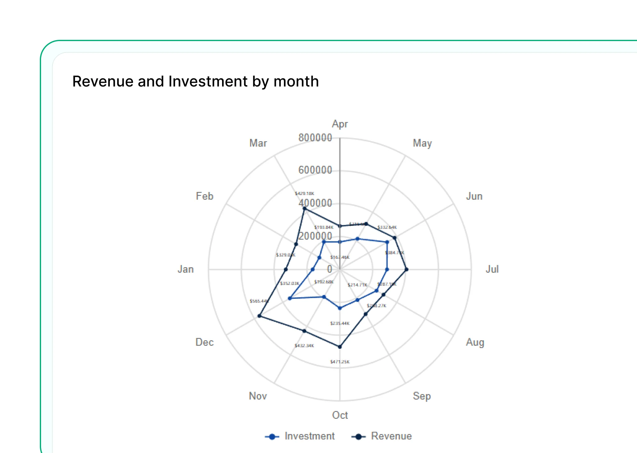
Polar Chart
Displays data in a circular format with values plotted along radial lines. Best for showing cyclical patterns or directional data.
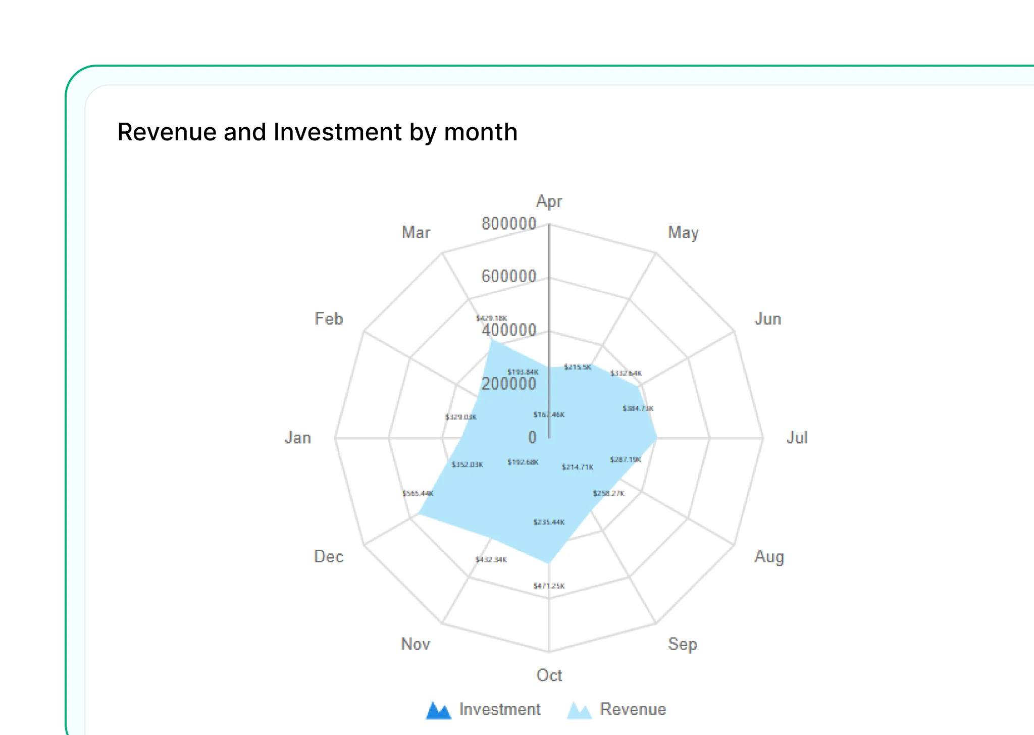
Radar Chart
Plots data on multiple axes from a central point—useful for comparing across categories.
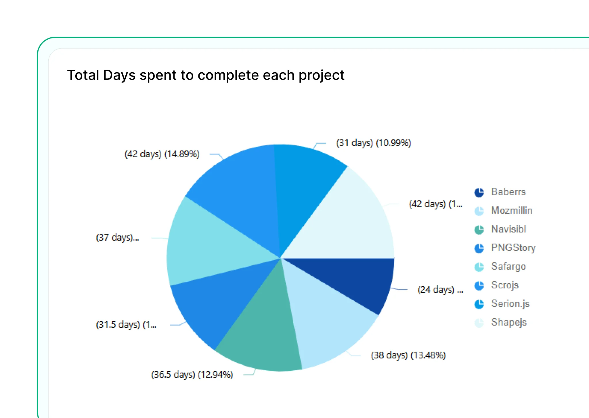
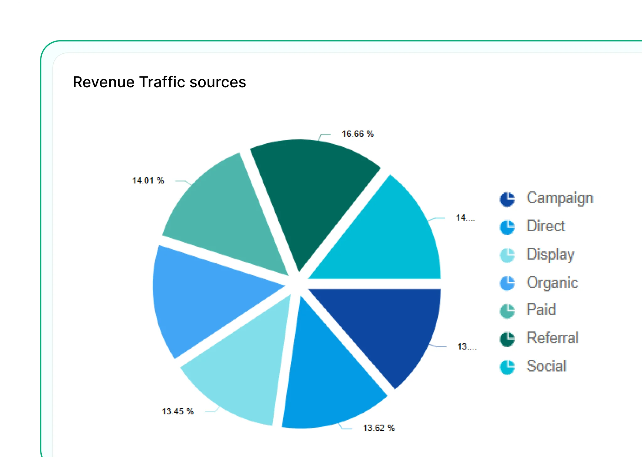
Pie Chart
Displays data as slices of a circle, showing how each category contributes to the total—best for simple comparisons.
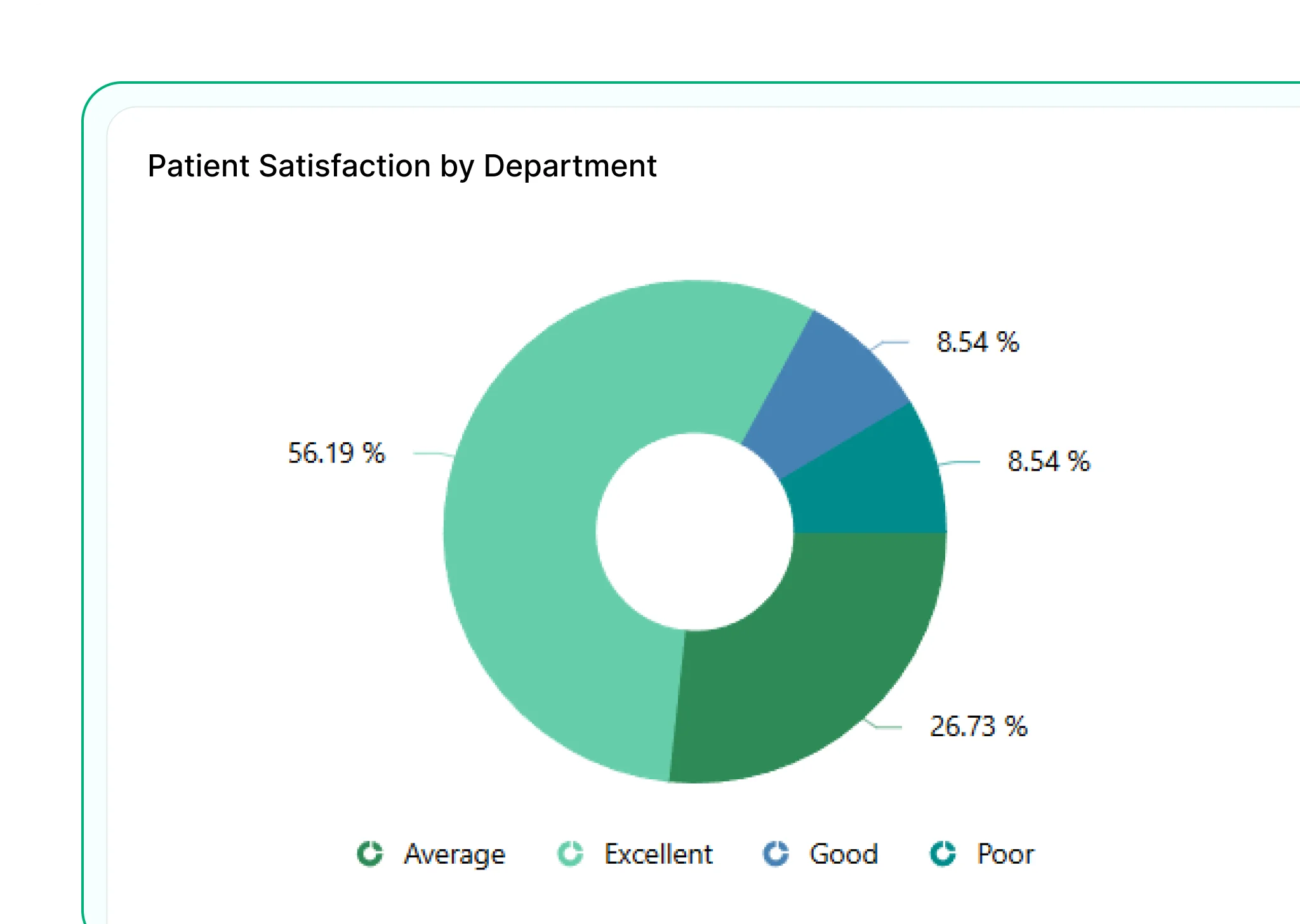
Doughnut Chart
Similar to a pie chart but with a central hole, allowing space for labels or values and offering a cleaner visual layout.
Exploded Pie
Separates one or more slices from the pie to emphasize specific segments. Useful for drawing attention to key contributors.

Funnel Chart
Illustrates stages in a linear process, such as a sales pipeline, and highlights drop-offs between steps.
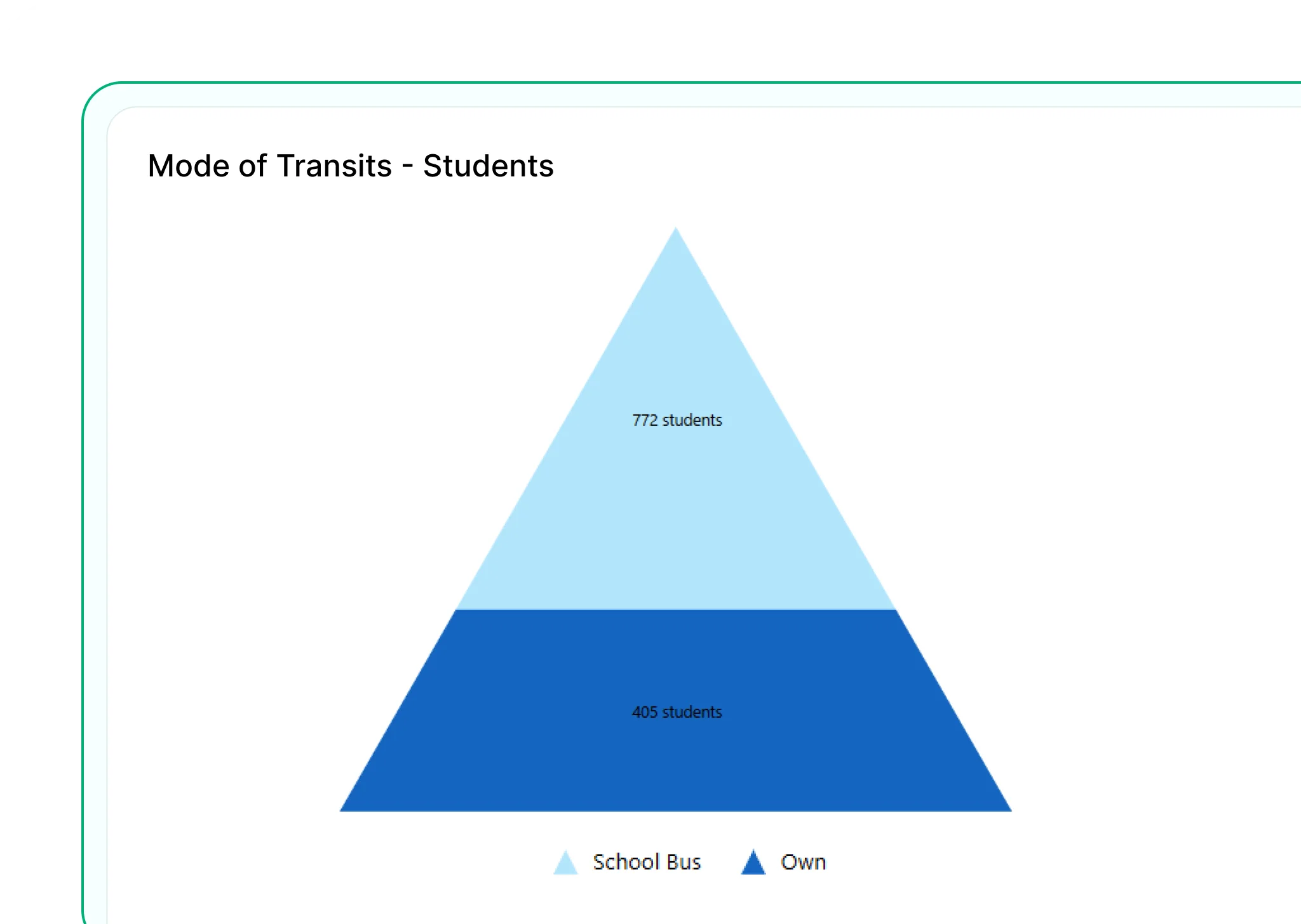
Pyramid Chart
Represents hierarchical data or processes with a layered structure, often used to show proportions in a top-down format.
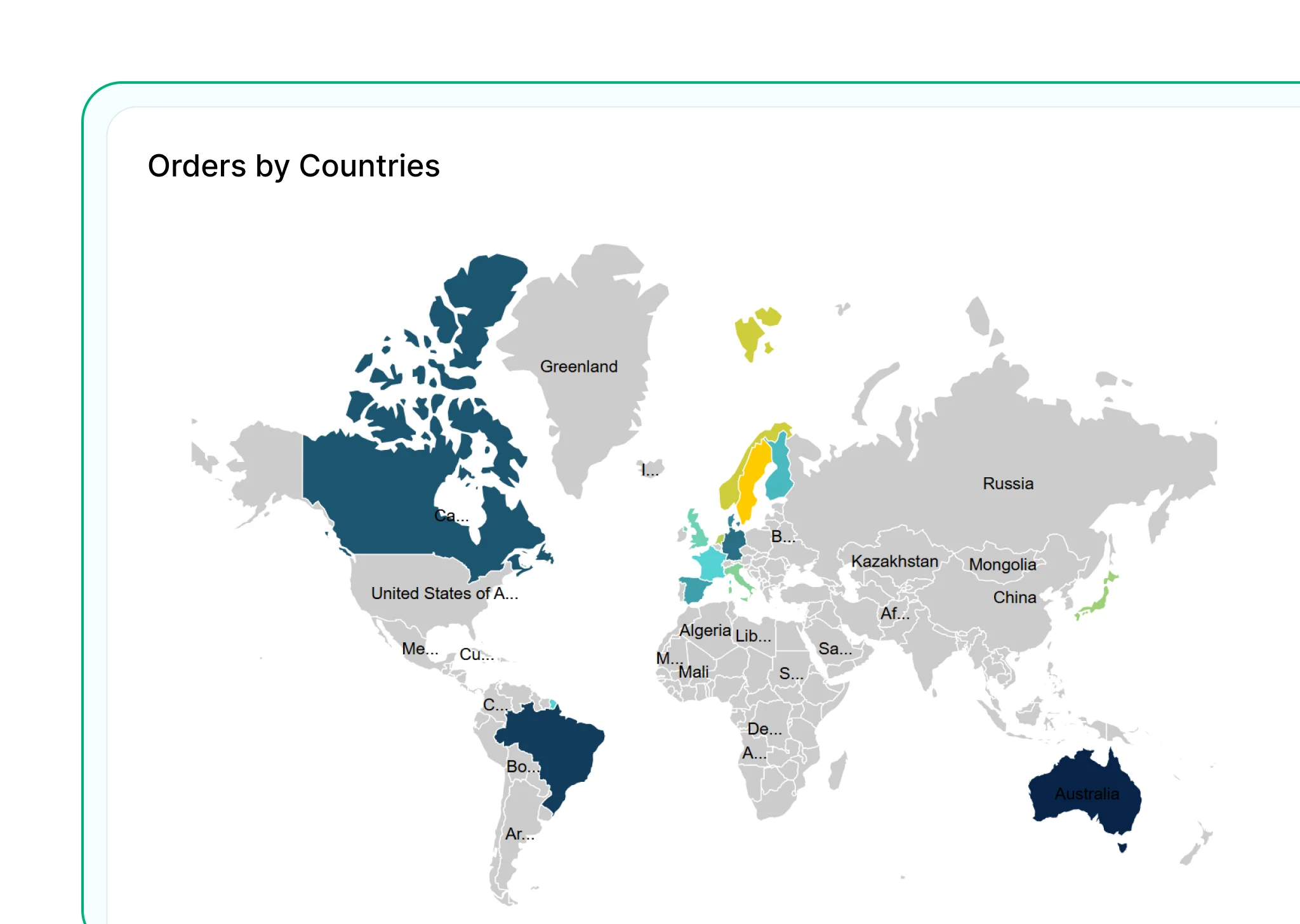
Map
Visualize geographic data using shapes or bubble maps. Ideal for sales, customer locations, or performance by area.
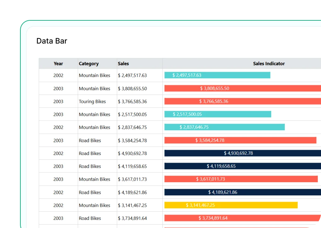
Data Bar
Mini bar charts embedded in table cells to show relative values visually. Helps you compare values within a row.
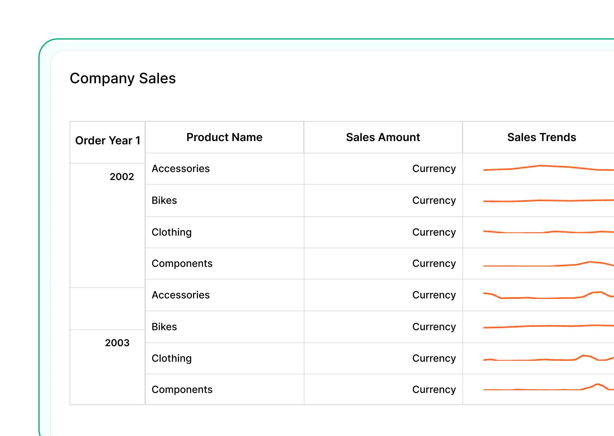
Sparkline
Tiny line or column charts that show trends over time within a single cell. Great for spotting patterns in a small space.


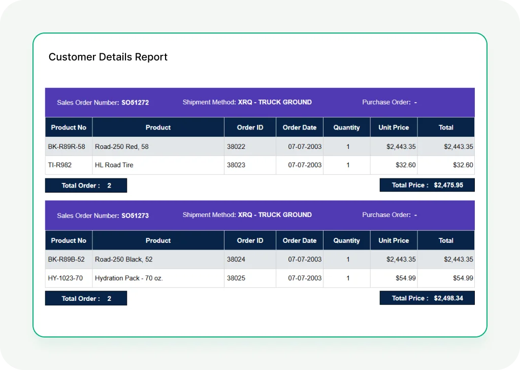
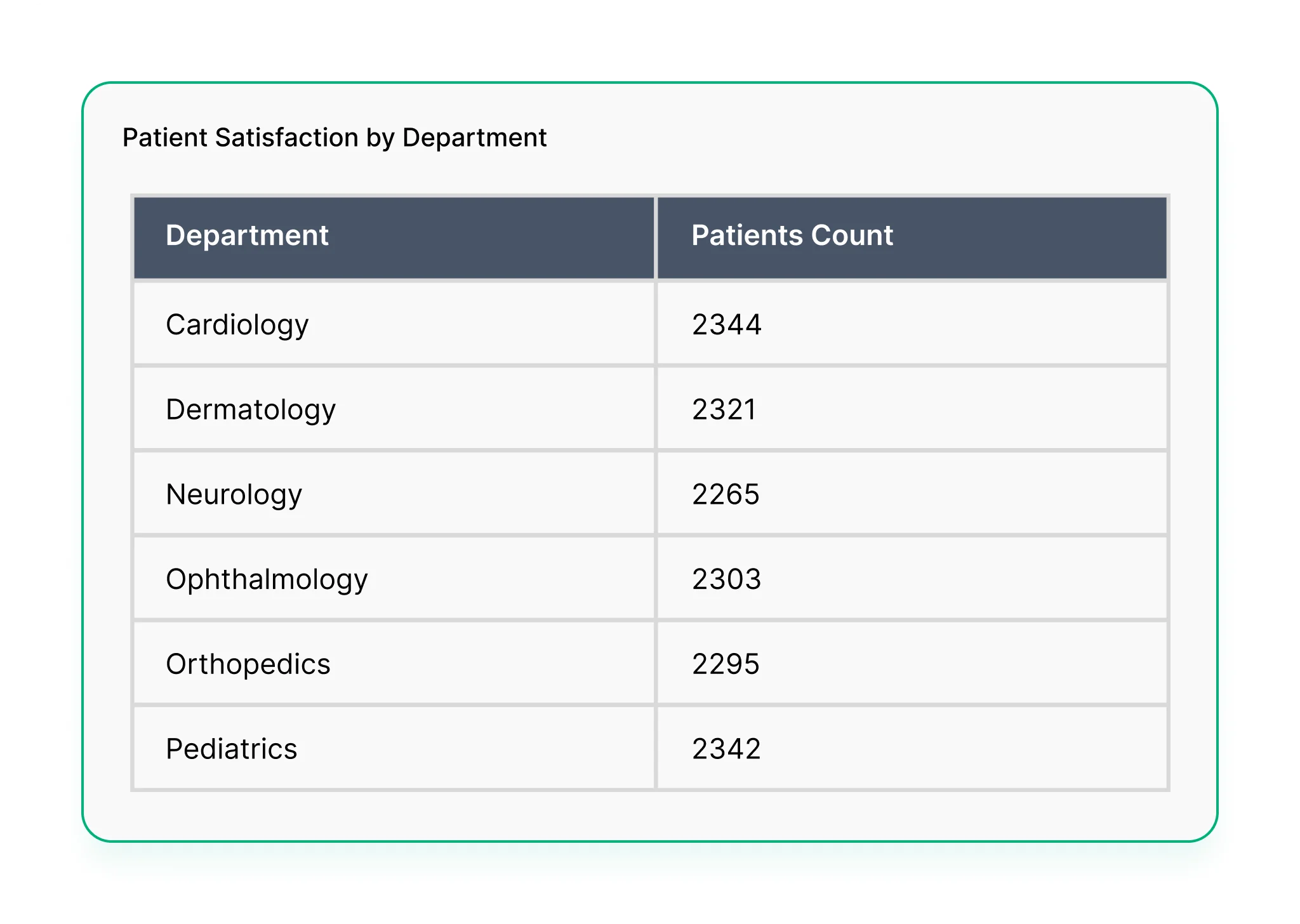
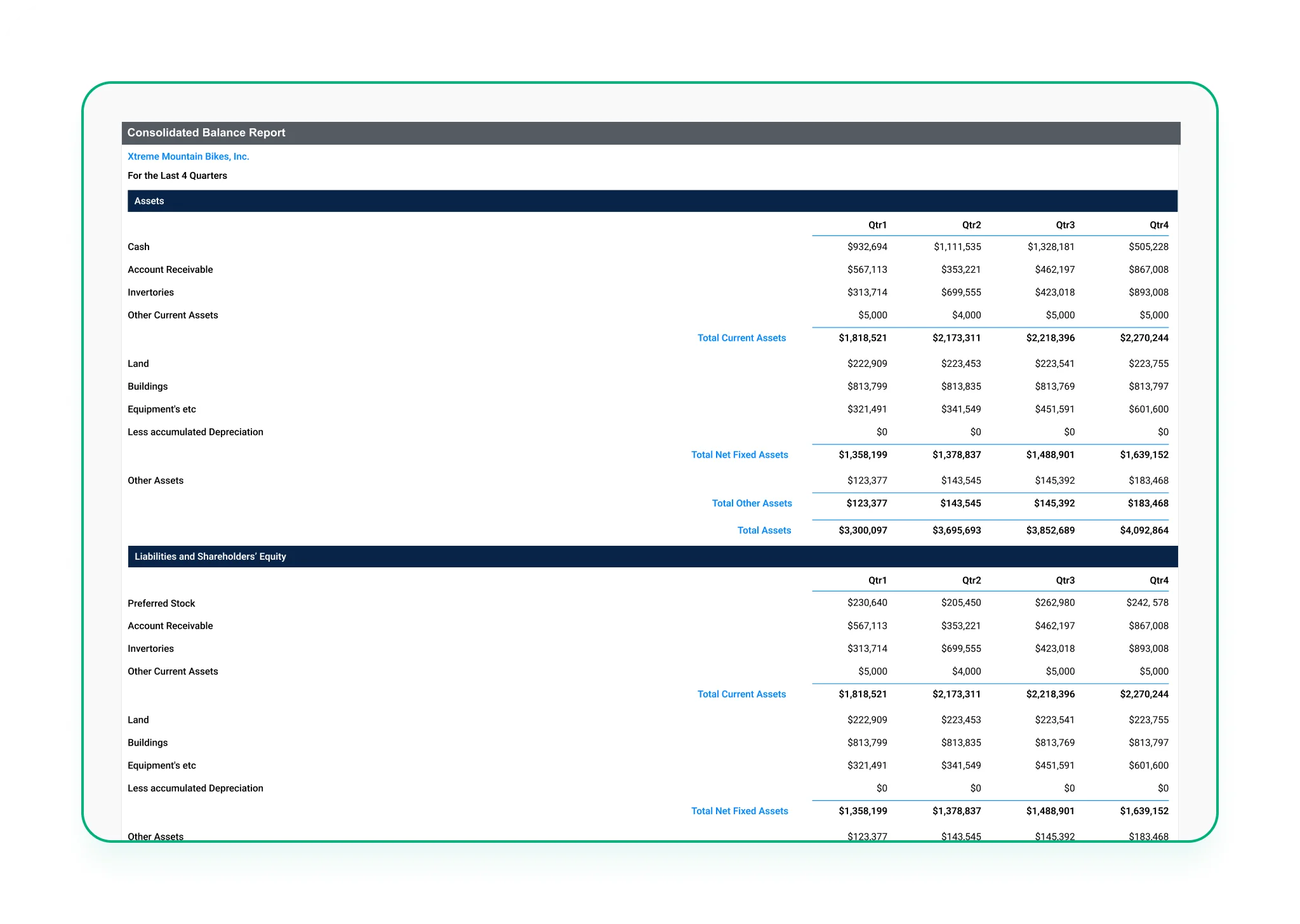
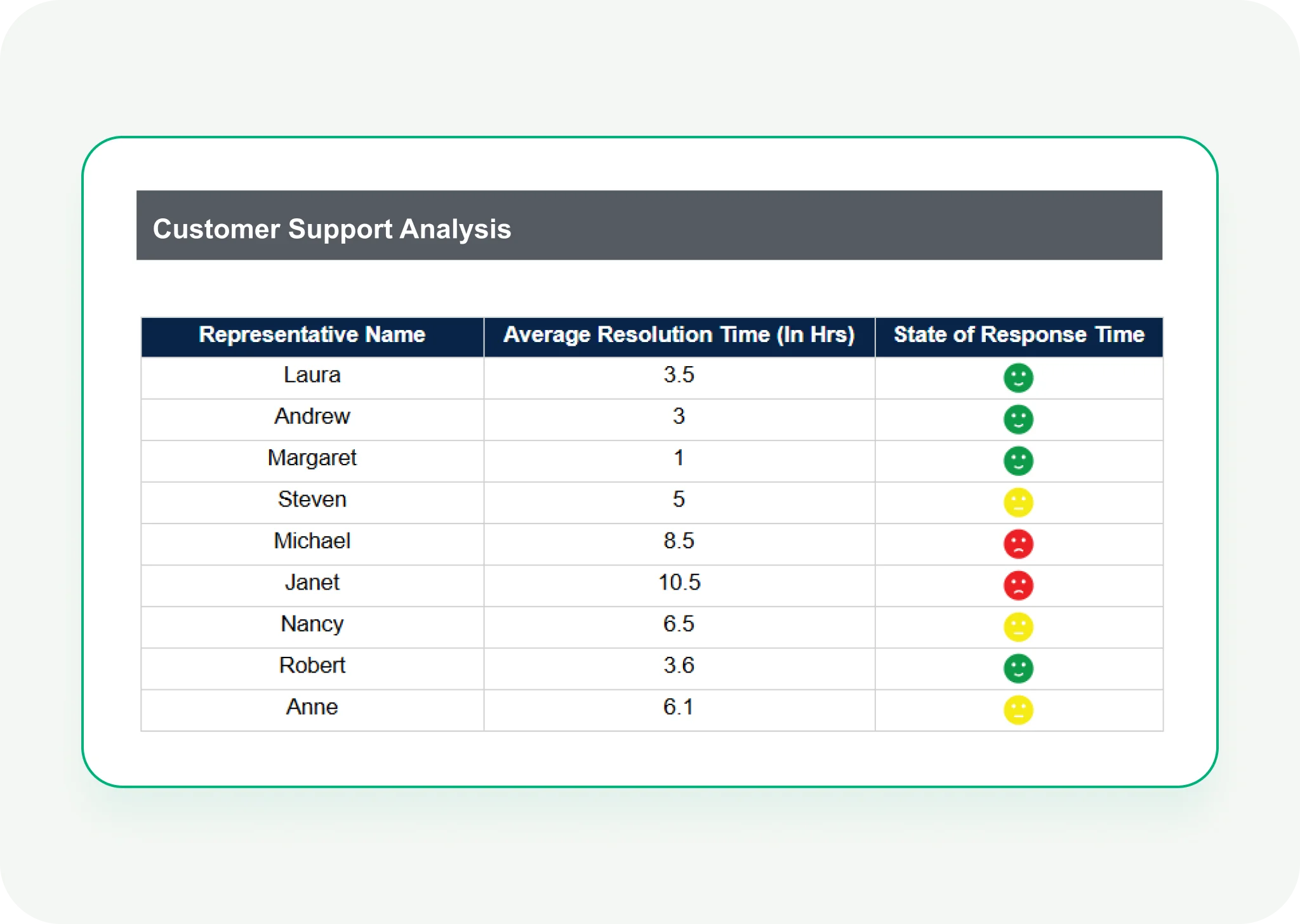
Table
Displays data in a grid of rows and columns—ideal for detailed records like invoices, transactions, or inventory.

List
Repeats a group of items for each row of data. Useful for custom layouts or showing nested data.
Matrix
Like a pivot table—groups data across rows and columns. Ideal for summaries like sales by region and quarter.
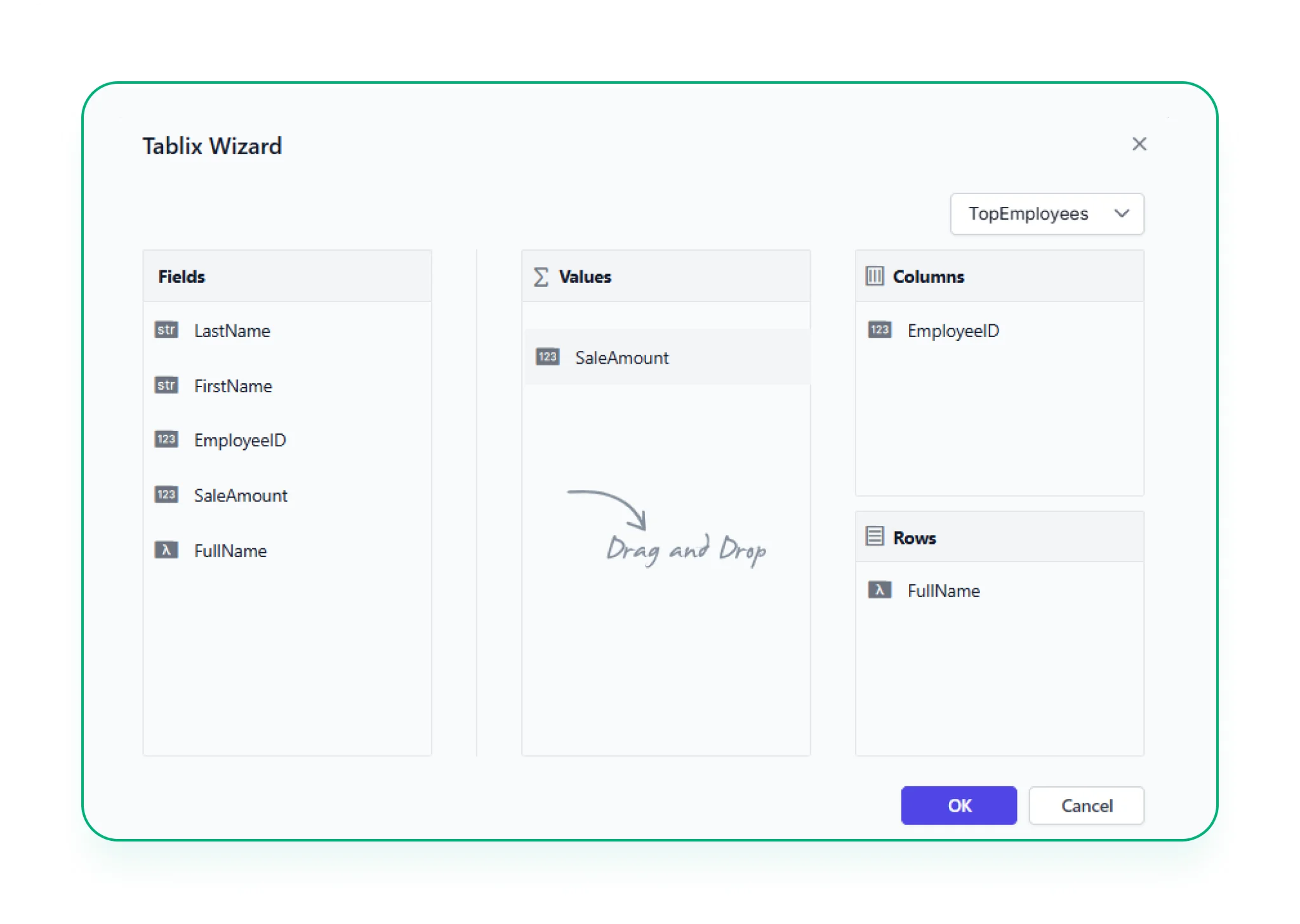
Tablix Wizard
A guided way to build complex layouts using table, matrix, or list elements—helping you structure data exactly how you need it.
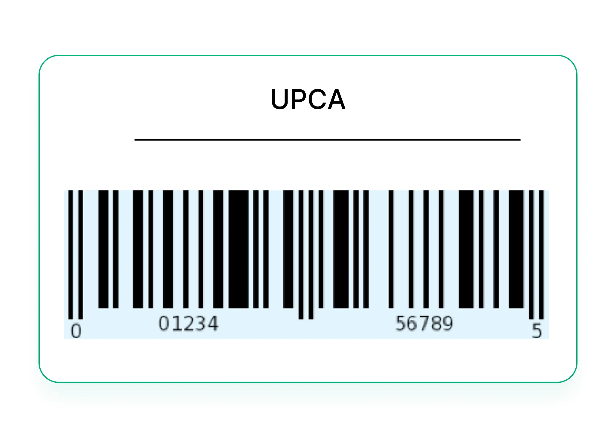
1D Barcode
Encodes data using parallel lines of varying widths—commonly used for scanning product IDs or tracking numbers.
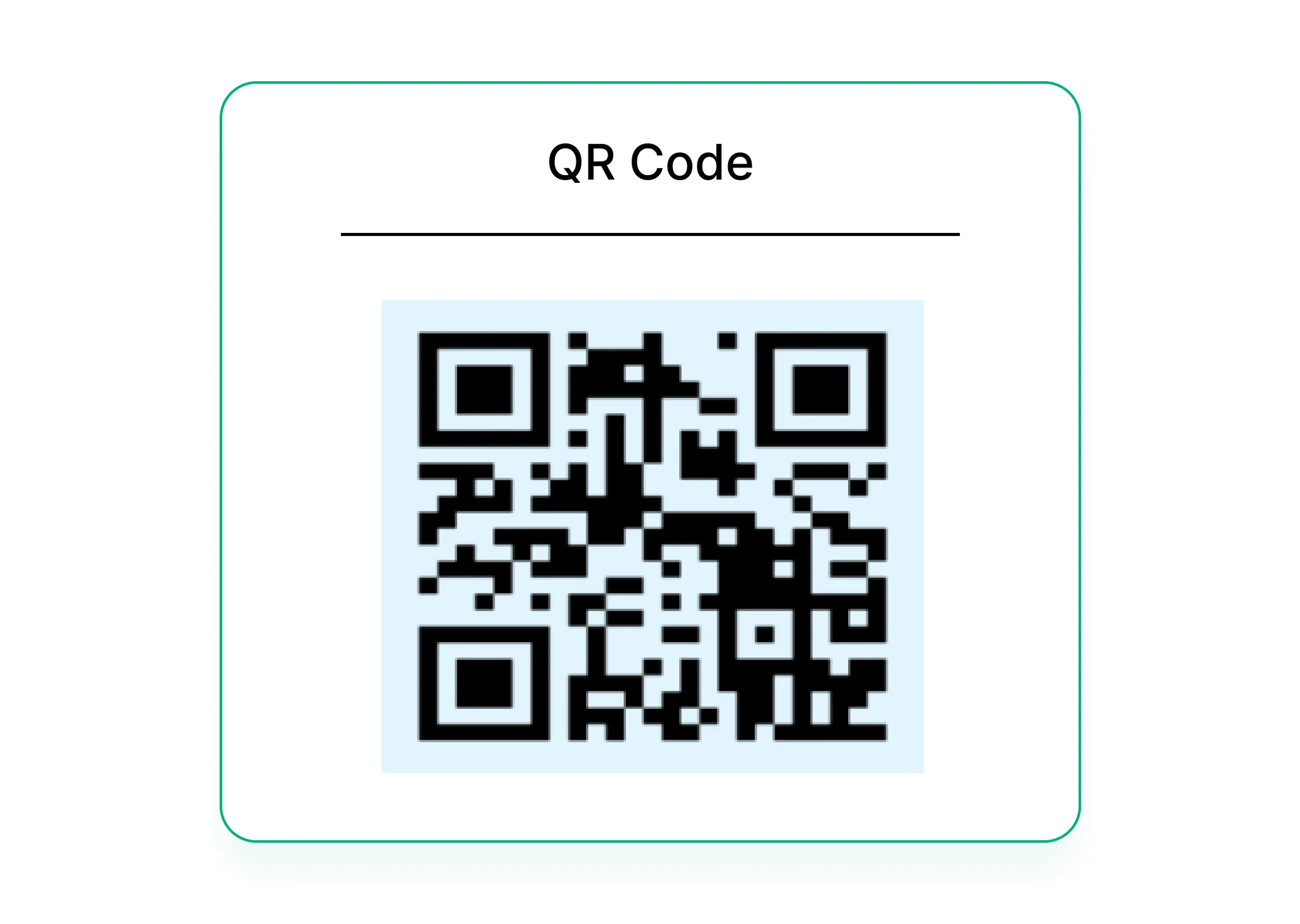
2D Barcode
Compact codes like QR codes that hold more data and can be scanned from any angle—great for links, IDs, or embedded info.
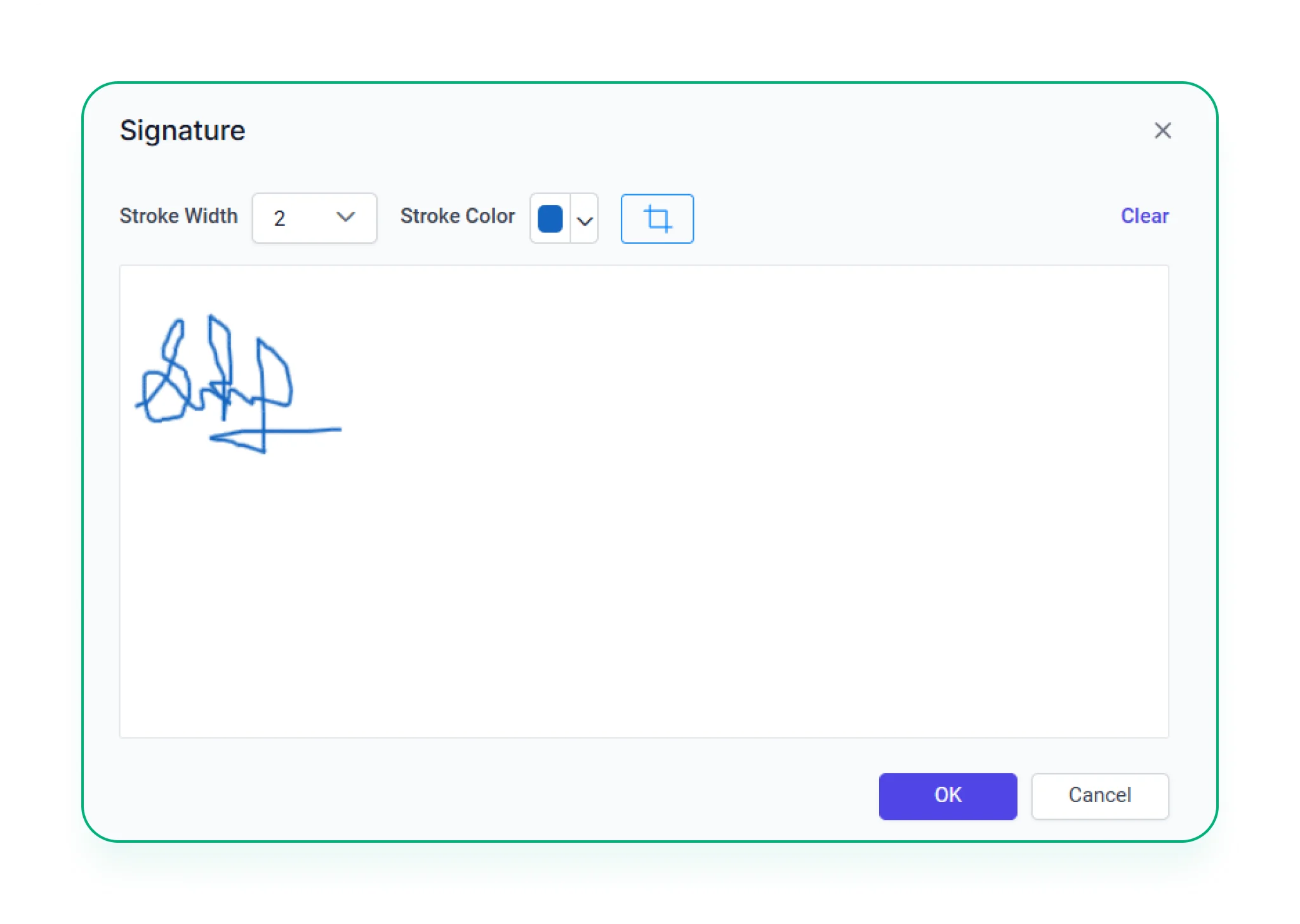
Signature
Capture digital signatures directly within the report—useful for approvals, confirmations, or compliance.

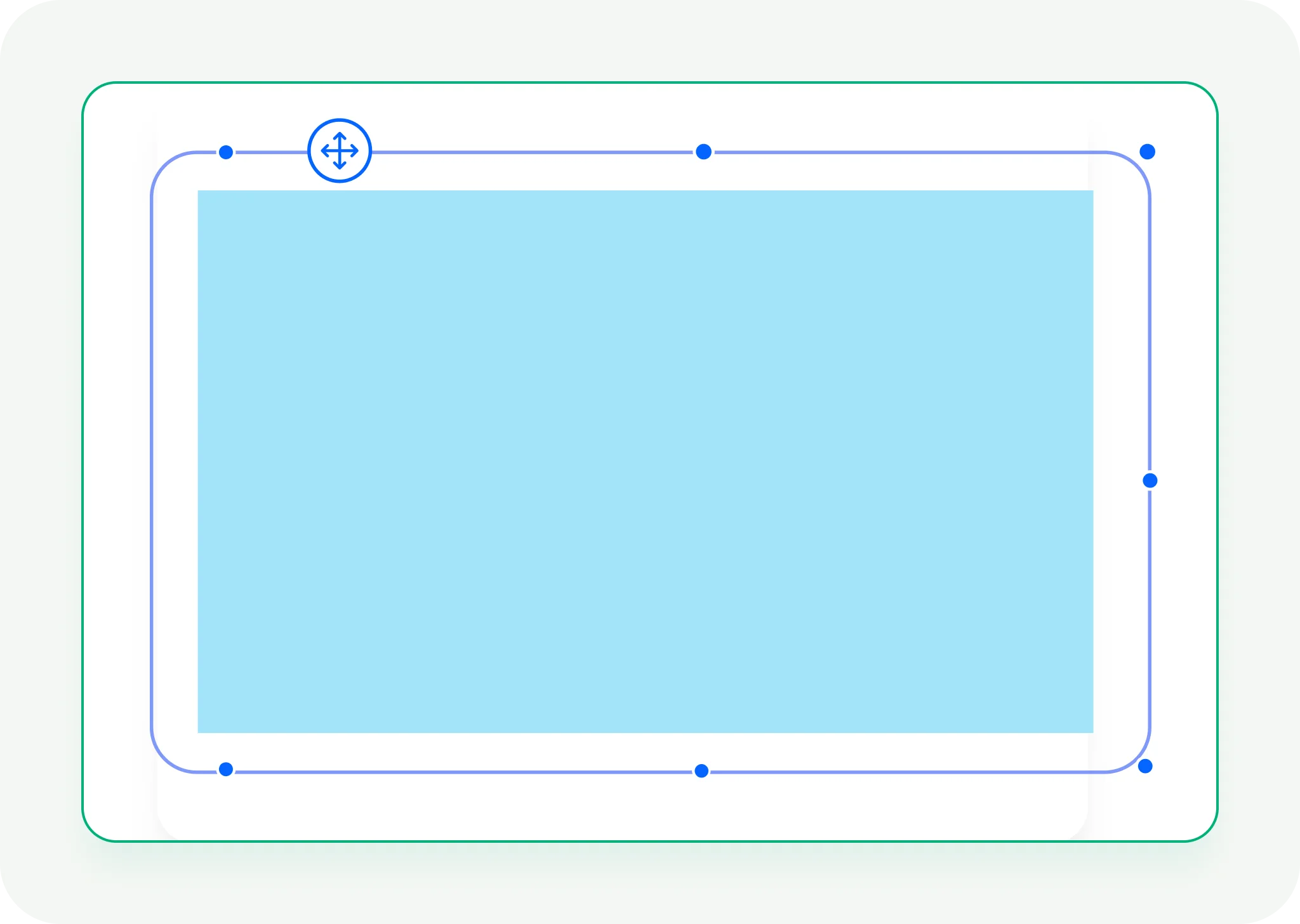
Print-Ready Visuals
Craft stunning reports with over 20+ built-in chart types including bar, column, pie, area, line, bubble, radar, funnel, and more.

Interactive User Experience
Let users explore data in real time with drill-downs, drill-throughs, filters, and sorting—making reports dynamic and engaging.

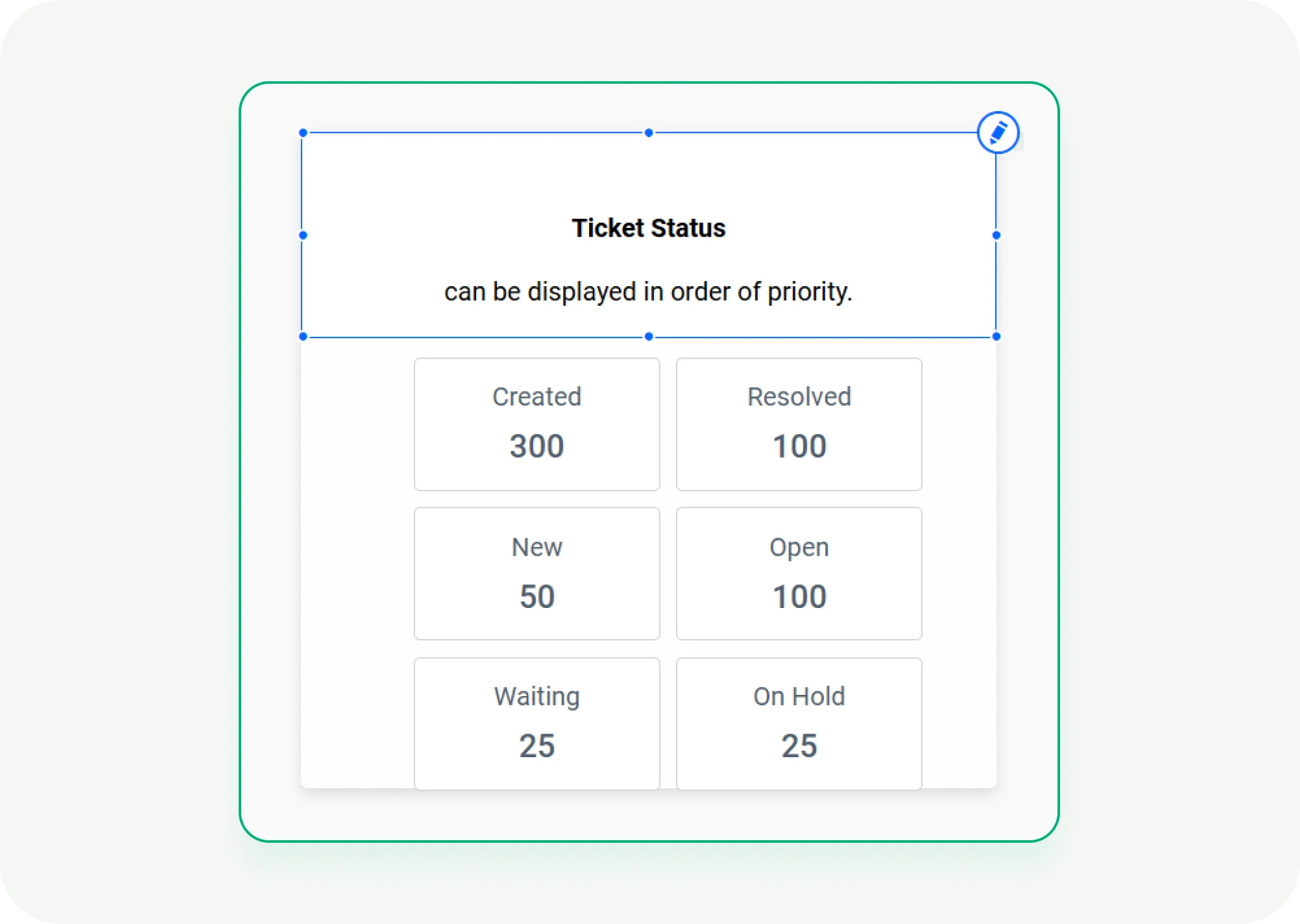
Visual Customization
Adjust every detail—axes, labels, colors, tooltips, and more. Apply business rules with conditional formatting.

Flexible Export Options
Export reports to PDF, Excel, Word, PowerPoint, and more—easy to share or use offline.

Security Made Simple
Control access with roles, permissions, and authentication—keeping your reports secure and compliant.
Tutorials and Webinars
Learn how to build interactive charts, apply visual formatting, and explore data effectively through expert-led sessions.

Comprehensive Documentation
Discover tips and examples for choosing the right chart types, highlighting trends, and telling compelling data stories.
Dedicated Support Team
Connect with our team for help with designing visuals, improving report clarity, or solving visualization challenges.